In the modern digital landscape, few debates spark as much conversation among users and designers alike as the choice between Dark Mode and Light Mode. It’s more than just a preference; it’s a critical decision that affects readability, accessibility, and overall User Experience (UX).
As digital experience experts, we at Webwhizz understand that the perfect website balances aesthetics with function. This deep dive will explore the science, the pros, and the cons of both modes, helping you determine the ideal design strategy for your own website.
The Science of Sight: How Our Eyes Process Contrast
To understand the UX implications of color schemes, we must first look at how the human eye processes contrast.
The core difference lies in how our pupils react to the display brightness:
- Light Mode (Dark Text on Light Background): The light background causes the pupil to constrict. This smaller opening, much like a camera aperture, results in a sharper, clearer focus. This is why standard print books have used black text on white paper for centuries—it generally maximizes text clarity and reading speed, especially in well-lit environments.
- Dark Mode (Light Text on Dark Background): The dark background causes the pupil to dilate (widen) to take in more light. While this reduces perceived glare and strain in low light, the wider pupil can sometimes introduce more minor refractive errors (known as the "halation effect" or "Müller-Lyer illusion"), causing light text to appear slightly blurry or glow against the dark background for some users, particularly those with astigmatism.
Deep Dive into Light Mode (The Traditional Standard)
Light Mode, with its traditional white or light-colored canvas, has been the default setting for most operating systems and websites since the dawn of computing.
The Advantages of Light Mode
Light Mode isn’t just tradition; it holds significant UX benefits, particularly for content-heavy sites:
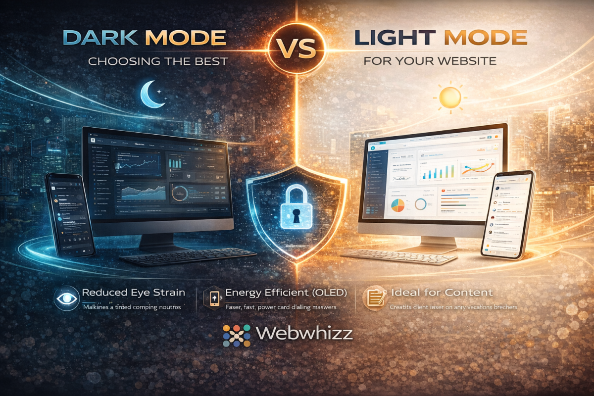
- Optimal Readability in Daytime: In bright or well-lit environments, the high contrast provided by dark text on a light background minimizes eye strain and maximizes reading comprehension.
- Superior Long-Form Reading: Decades of cognitive research support the fact that most users process long passages of text slightly faster and more efficiently when reading dark-on-light.
- Print and Accessibility Standards: Light Mode adheres closely to the contrast ratios commonly expected in print media, which feels familiar and accessible to the vast majority of users.
- Vibrant Visuals: Light backgrounds often make colorful images, charts, and brand elements appear brighter and more vibrant.
The Drawbacks of Light Mode
- Excessive Glare: In low-light environments (e.g., reading late at night), the bright white screen acts as a harsh light source, leading to significant eye strain and discomfort.
- Blue Light Exposure: High exposure to the blue light emitted by bright screens can interfere with natural sleep patterns (circadian rhythm).
Deep Dive into Dark Mode (The Modern Trend)
Dark Mode exploded in popularity over the last decade, transitioning from a specialized tool for developers and gamers into a mainstream feature on all major operating systems. It is often perceived as sleeker, more modern, and easier on the eyes.
The Advantages of Dark Mode
- Reduced Eye Strain in Low Light: This is the primary benefit. By decreasing the overall luminance of the screen, Dark Mode drastically reduces glare and light emission in dark environments.
- Energy Efficiency (OLED/AMOLED): For devices utilizing OLED or AMOLED screens (many modern phones and tablets), displaying true black pixels means those pixels are completely turned off. This can lead to substantial battery savings.
- Aesthetic Appeal: Dark themes often lend themselves to sophisticated, dramatic, and immersive design aesthetics, making them popular for creative portfolios, video streaming, and entertainment sites.
- Focus Enhancement: By subduing the UI elements, Dark Mode can help the user focus intensely on content like images or videos that use bright, contrasting colors.
Key Challenges in Dark Mode Implementation
Implementing Dark Mode effectively requires careful design to avoid common pitfalls:
- The Halation Effect: As noted earlier, the glowing effect of light text on a dark background can cause fatigue or fuzziness for some users, particularly those with astigmatism.
- Poor Contrast Choices: A common mistake is using pure white text (#FFFFFF) on true black (#000000). This maximum contrast can actually be too harsh. Professional designs often rely on very dark gray backgrounds and off-white or light gray text to soften the transition and improve readability.
- Color Shift: Saturated colors (like bright reds or blues) that look great in Light Mode may appear overly aggressive or "vibrating" in Dark Mode, requiring a complete color palette adjustment for the alternate theme.
The Ultimate UX Question: Which is Better for Your Website?
The truth is, there is no single "best" choice. The optimal mode depends entirely on your target audience, the nature of your content, and the context in which your site is typically viewed.
1. Analyze Your Content and Audience
| Website Type | Primary Recommendation | Rationale | | :--- | :--- | :--- | | Blogging/News/E-commerce | Light Mode (Default, with Dark Option) | Prioritizes fast readability and quick scanning of dense product information. | | Creative Portfolios/Film/Gaming | Dark Mode (Default, with Light Option) | Enhances visual storytelling, provides a cinematic feel, and minimizes distraction. | | Data Dashboards/Coding Platforms | Dark Mode (Strong Preference) | Reduces strain during long sessions and makes complex color-coded elements stand out clearly. |
2. Prioritize User Choice
The gold standard in modern web design is dynamic theming. Instead of forcing a choice, empower your users:
- System Preference Matching: Automatically detect the user's operating system setting (Light or Dark) and default to that theme.
- Visible Toggle Switch: Provide a clear, accessible toggle switch (usually in the header or user profile settings) so the user can switch instantly without losing their place.
How Webwhizz Makes the Choice Easy
Implementing a dynamic, multi-themed website is technically complex. It requires not just flipping colors, but ensuring that all elements—from icons and logos to accessibility features and embedded widgets—maintain optimal contrast ratios in both environments.
This is where the expertise of a professional web design team becomes essential.
About Webwhizz
At Webwhizz, we understand that a truly dynamic website is one that adapts to the user. We specialize in designing and developing modern, high-performance websites that prioritize accessibility, aesthetic appeal, and technical precision. We don't just build websites; we craft personalized digital experiences that adapt to evolving user preferences.
When we design your site, we analyze your audience and content to advise you on the most effective default theme. Crucially, we then handle the meticulous process of developing a fully optimized, WCAG-compliant Dark Mode and Light Mode, ensuring seamless transitions and perfect contrast across all devices.
Ready to offer your users the ultimate control over their digital experience? Learn more about our UX-focused design services at webwhizzservices.com.
Conclusion: Designing for Flexibility
The debate between Dark Mode and Light Mode is a reflection of shifting user expectations. Users no longer expect a static experience; they expect personalization.
While Light Mode remains the gold standard for pure text readability and daylight use, Dark Mode offers substantial benefits for low-light environments, energy savings, and modern aesthetics.
For optimal User Experience, the winning strategy is clear: Don't choose one. Provide both. By integrating both themes seamlessly into your design, you show your audience that you value their comfort, health, and personal preference—a hallmark of professional, high-quality web development.