WebWhizz Blog -
Expert Digital Insights.
Expert thoughts on design, technology, and digital growth strategies. No fluff, just value.
Voice Search Readiness
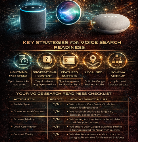
Is your website “readable” by Alexa and Siri? We live in a world where talking to our devices is as common as typing on them. From checking the weather on your smart speaker to navigating your commute using a voice assistant, conversational technology has fundamentally changed how we search for information. But for businesses, this shift presents a massive question: Is your website optimized for the way people actually speak? If your site isn't ready for natural, conversational queries, you are already missing out on a significant and growing percentage of traffic, visibility, and potential customers. At webwhizz, we specialize in ensuring your digital presence is not just visible, but audible. This comprehensive guide breaks down exactly what voice search readiness means in 2024 and how our specialized services can bridge the gap between your website and the smart speakers in your customers’ homes. The New Conversation: Why Voice Search Matters Now Voice search is not a futuristic concept; it is the current reality. Unlike traditional desktop queries, which are often short, choppy, and keyword-focused ("best accountant NYC"), voice searches are typically longer, structured as full sentences, and centered around a direct question ("Hey Siri, who is the best accountant near me who specializes in small business tax?"). This distinction is crucial for one main reason: Voice assistants almost always provide only one result. When a user types a query, they receive ten blue links. When they speak a query, the assistant (whether it’s Alexa, Siri, or Google Assistant) pulls one definitive answer, often sourced from Google’s Featured Snippet or Position Zero. If your content isn't structured to win that single coveted spot, you become invisible to the voice revolution. The 5 Pillars of Voice Search Readiness Achieving voice search readiness requires a holistic approach that merges technical excellence with human-centric content strategy. Here are the five critical areas WebWhizz focuses on: 1. Speed is King (The Technical Foundation) When we talk about voice search, speed isn't a luxury; it's a requirement. Voice assistants prioritize websites that load instantly because users expect immediate answers. A delay of even one second can cause the assistant to drop your site and move to a faster competitor. Technical Checks Required for Voice: · Mobile-First Indexing: Since most voice searches originate from mobile devices (smartphones) or devices with high sensitivity to speed (smart speakers), your site must be fully optimized for mobile. · Core Web Vitals: We analyze and optimize key performance metrics like Largest Contentful Paint (LCP) and First Input Delay (FID) to ensure a lightning-fast user experience. If your site feels sluggish, it won’t cut it for voice. Our Technical SEO Audit services are designed to rebuild your foundation for peak performance. 2. Mastering Conversational Keywords (The Content Shift) The language we use when speaking differs significantly from the language we use when typing. Voice search demands a shift from focusing solely on head terms to prioritizing long-tail, natural language queries. You must anticipate the questions your audience asks out loud. | Typing Query | Voice Search Query | | :--- | :--- | | web design costs | How much does a professional website cost? | | 24-hour plumber | Is there a 24-hour plumber available right now? | Our webwhizz content team dives deep into intent analysis, structuring content that directly answers these spoken questions using the 'who,' 'what,' 'where,' and 'how' framework. We build comprehensive FAQ sections and conversational content hubs that perfectly align with spoken user intent. Learn how to talk directly to your audience’s smart speakers with our Content Marketing and Strategy services. 3. Claiming the Featured Snippet (Position Zero) The Featured Snippet (or "Answer Box") is the short, highly relevant piece of text Google places at the very top of search results. In voice search, this snippet is almost always the chosen answer read back to the user. To win this coveted "Position Zero," content must be: Concise and Direct: Answer the question immediately (in 40–60 words). Structured: Use clear headings (H2, H3), numbered lists, and tables to organize information, making it easy for the search engine to extract. Authoritative: Demonstrate clear expertise on the topic. 4. The Local Search Imperative A vast percentage of voice searches have local intent, often driven by users on the go: "Alexa, find a coffee shop near me that's open." If your business relies on foot traffic or servicing a local area, your Local SEO must be flawless for voice readiness. This involves far more than just having the right city in your title tag. Key actions we take: Google Business Profile (GBP) Optimization: Ensuring your name, address, and phone number (NAP) are 100% accurate across the web. This is the primary data source for "near me" voice queries. Geo-specific Keyword Strategy: Optimizing content for hyper-local terms and neighborhood names. Consistency: Ensuring your hours, services, and location information are identical across every digital directory. Make sure local voice assistants guide customers straight to your door. Explore our specialized Local SEO services. 5. Speaking the Language of Robots (Schema Markup) While conversational keywords help humans understand your site, Schema Markup (Structured Data) helps search engine crawlers and voice assistants understand the context of your information. Think of Schema as the universal translator of the internet. By adding invisible code to your website, you can tell Siri exactly what type of content you have: "This is a recipe." "This is our business’s official phone number." "This is a review rating." "This is a Frequently Asked Question (FAQ)." Implementing the correct Schema is critical for voice, especially FAQ Schema and LocalBusiness Schema, as it dramatically increases the chance that your content will be extracted and read aloud accurately by an AI assistant. Your Voice Search Readiness Checklist Are you hitting the necessary markers to be heard by Alexa and Siri? | Action Item | Ready? | How WebWhizz Helps | | :--- | :--- | :--- | | Mobile Speed | Y/N | We optimize Core Web Vitals for instant loading speeds. | | Conversational Content | Y/N | We research and create long-tail, question-based content. | | Schema Markup | Y/N | We implement precise structured data to define your content. | | Local Optimization | Y/N | We ensure your Google Business Profile is fully optimized for "near me" queries. | | Content Clarity | Y/N | We structure answers in short, concise paragraphs suitable for Featured Snippets. | Don't Whisper, Be Heard: Partnering with webwhizz Voice search is not the future of SEO—it is the present. Ignoring the shift toward conversational search means willingly handing market share over to competitors who are optimized for the way people actually engage with technology. At webwhizzservices.com, our mission is to future-proof your digital strategy. We don't just chase algorithms; we optimize for human behavior, ensuring your business is ready to answer when the next voice query is spoken. Ready to make your website audible to millions of smart device users? Contact webwhizz today and let us help you achieve true Voice Search Readiness.
Sustainability in Web Design How Green Hosting and Clean Code Reduce Your Brand’s Carbon Footprint
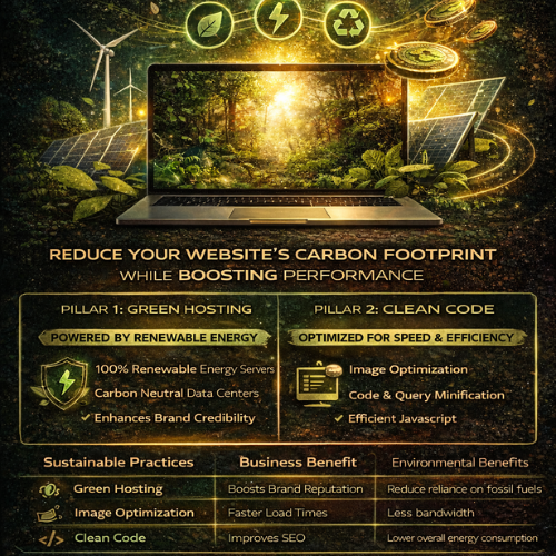
The internet is where modern business lives, yet few businesses consider the environmental cost of their digital presence. Every click, every image load, and every server request consumes energy—a surprising amount of energy. At webwhizz, we believe that exceptional web design must also be responsible web design. We are dedicated to building digital experiences that not only perform flawlessly but also respect the planet. If you are committed to corporate social responsibility (CSR), optimizing your website for sustainability is the most powerful digital action your brand can take. This guide explores the two critical pillars of eco-friendly web development: Green Hosting and Clean Code. The Hidden Carbon Footprint of the Digital World Before we dive into solutions, let’s address the scale of the problem. The global network of data centers, transmission networks, and end-user devices currently uses more electricity than entire nations. Research estimates that the ICT sector is responsible for roughly 3.7% of global greenhouse gas emissions—a figure comparable to the entire aviation industry. Why is this footprint so large? Always-On Servers: Data centers run 24/7, requiring massive amounts of energy for computing and, critically, for cooling. Data Transfer: Every byte of data transferred across the internet requires energy. Bloated websites require more data to download, placing higher strain on global networks. End-User Strain: Inefficient code forces user devices (laptops, phones) to work harder, draining batteries faster and consuming more household electricity. For brands committed to sustainability, this digital pollution presents a significant blind spot. Fortunately, the solutions are accessible and highly beneficial for your bottom line. Pillar 1: Choosing Green Hosting (The Infrastructure Solution) The single greatest immediate impact you can make on your website’s footprint is ensuring the physical servers housing your data are powered sustainably. This is where Green Hosting comes in. What is Green Hosting? Traditional data centers rely heavily on fossil fuels. Green Hosting providers actively counteract this by committing to one of two practices (or both): Renewable Energy Sources: The provider physically purchases electricity generated from wind, solar, or hydro power to run their data centers. Carbon Offsetting: The provider invests in certified renewable energy credits (RECs) or verified carbon reduction projects (e.g., reforestation) equivalent to the amount of energy they consume. Switching to a provider that uses 100% renewable energy ensures that your brand’s digital home is ethically sourced. Why Green Hosting Matters for Your Brand Identity In today’s market, consumers are increasingly choosing brands based on shared values. Simply stating that your brand is eco-friendly isn't enough; you must demonstrate it through verifiable action. By opting for Green Hosting, you achieve several key advantages: Authentic CSR: You close the loop between your physical environmental practices and your digital presence. Marketing Advantage: You gain a verifiable, quantifiable claim that can be proudly displayed on your website and in annual sustainability reports. Future-Proofing: You align your infrastructure with global regulatory trends prioritizing renewable energy adoption. Our Services: At WebWhizz, we partner exclusively with certified, high-performance Green Hosting providers. We integrate sustainable hosting setup directly into our web development packages, ensuring your site is green from day one. Learn more about our hosting services at webwhizzservices.com. Pillar 2: The Power of Clean Code and Efficient Design (The Optimization Solution) Green Hosting addresses the "where" (the server power), but Clean Code addresses the "how much" (the data transfer required). Efficient, streamlined code and minimalist design dramatically reduce the amount of energy needed to load, process, and display your website. When a website is lighter and faster, it uses less energy across the entire network chain—from the server to the user's mobile processor. 1. Streamlining the Codebase (The Backend & Infrastructure) Sustainable development starts behind the scenes. Our focus at WebWhizz is on maximizing efficiency and minimizing waste. Code Minification: Removing unnecessary characters, comments, and whitespace from HTML, CSS, and JavaScript files reduces file size without altering functionality. Smaller files mean faster transfer times and less server processing. Efficient Database Queries: Slow, poorly optimized database queries consume significant server resources. We engineer lean databases and optimize APIs to fetch only the necessary data, speeding up load times and reducing server strain. Choosing Efficient Frameworks: Selecting lightweight, modern frameworks over bloated, legacy systems ensures that the core structure of your site is designed for performance and speed. 2. Prioritizing Performance Over Bloat (The Frontend) The most significant energy drain on the frontend comes from unoptimized media and excessive scripting. A. Smart Image and Media Handling Images are often the heaviest elements on a webpage. Reducing their load is crucial for sustainability: Next-Gen Formats: Using modern image formats like WebP or AVIF results in the same quality image at a fraction of the size compared to JPEG or PNG. Lazy Loading: Images and videos only load when the user scrolls them into view, dramatically reducing the initial data transfer required for the first page view. Responsive Images: Serving different image resolutions based on the user's screen size (e.g., a small image for mobile, a larger one for desktop). B. JavaScript Control Excessive third-party scripts (trackers, marketing tools, analytics) are notorious for slowing down sites. Audit and Prune: Regularly auditing and eliminating redundant or inefficient third-party scripts. Deferring Non-Critical JS: Ensuring non-essential JavaScript loads after the main content is visible, improving perceived performance and minimizing the initial energy spike. C. Typography and Color Even seemingly small design choices impact data usage: System Fonts: Using system fonts rather than loading custom web fonts eliminates the need to download large font files. Dark Mode (Optional): For users accessing sites on OLED or AMOLED screens (common on smartphones), displaying darker colors requires less energy than displaying bright white light. Our Services: We specialize in high-performance web development. Our clean code philosophy ensures your site achieves top-tier scores on Core Web Vitals, a crucial component of both SEO and sustainability. Let us conduct a comprehensive performance audit for your existing site: webwhizzservices.com/services. The Sustainable ROI: Sustainability Equals Superior Performance The remarkable truth about sustainable web design is that minimizing your carbon footprint is perfectly aligned with maximizing your business performance. The most eco-friendly website is also the fastest and most accessible website. | Sustainable Practice | Business Benefit | Environmental Benefit | | :--- | :--- | :--- | | Green Hosting | Brand credibility and ethical alignment. | Reduces reliance on fossil fuels. | | Code Minification | Faster loading times; better Google ranking. | Less data transferred; less server energy consumption. | | Image Optimization | Improved user experience; reduced bounce rates. | Less bandwidth used on the network. | | Optimized Database | Lower hosting costs; increased server efficiency. | Reduced 24/7 power consumption in data centers. | Search Engine Optimization (SEO): Google explicitly favors fast, responsive websites. By optimizing for sustainability (speed), you are automatically optimizing for better visibility in search rankings. A sustainable site is an authoritative site. Conclusion: Build Your Future Responsibly with WebWhizz The digital future is not just fast; it must be green. Sustainability in web design is no longer an optional add-on—it is a fundamental responsibility for modern businesses seeking both ethical alignment and peak operational performance. By pairing certified Green Hosting with expertly optimized clean code, you drastically reduce your brand's environmental impact while delivering a superior experience to your users. Ready to transform your website into a powerful, high-performance, and sustainable asset? Contact WebWhizz today to discuss how our Green Hosting and clean development services can future-proof your digital presence and cement your brand as a leader in responsible technology. Start your sustainable journey now: webwhizzservices.com
Speed as a Sales Metric The Financial Impact of Every 0.1 Seconds
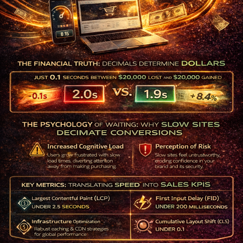
In the digital world, speed isn't a luxury; it's the fundamental currency of customer experience. For too long, website performance has been relegated to the IT department—a technical detail managed by developers. But if you own an e-commerce platform or a lead-generation site, it’s time to reclassify speed. Speed is not a feature. It is a sales metric. At WebWhizz, we understand that microseconds translate directly into thousands of dollars in revenue. If you want to outperform your competitors, you must stop viewing load time as a technical challenge and start viewing it as the single most critical bottleneck to your conversion rate. This deep dive will show you precisely how every fraction of a second impacts your bottom line, and how optimizing that speed is the most powerful investment you can make in your business growth. The Financial Truth: Decimals Determine Dollars The difference between a 2.0-second load time and a 1.9-second load time may seem negligible to the untrained eye, but it is catastrophic in the conversion funnel. Modern internet users are fiercely impatient. They demand instant gratification, and if your site doesn't deliver, they don't give you a second chance—they click the "back" button. The 0.1 Second Effect: Quantifying the Loss Research conducted by industry leaders like Google, Akamai, and Amazon has unequivocally proven a direct, linear relationship between load time and business results. Consider these sobering facts based on aggregated industry data: For every 1-second delay in mobile load time, conversions can drop by an average of 20%. The first 5 seconds of page load time have the highest impact on conversion rates. As load time increases from 1 second to 5 seconds, the probability of a bounce increases by 90%. A mere 0.1-second improvement in load time can boost critical sales metrics: Mobile conversion rates can increase by up to 8.4%. Average Order Value (AOV) can improve by nearly 2%. Bounce rates can decrease significantly, freeing up your marketing budget to work harder. If your site loads in 3.5 seconds and generates $50,000 in monthly revenue, speeding it up by just one second could realistically increase your revenue by $5,000 to $10,000 without acquiring a single new lead. Speed optimization is simply conversion rate optimization (CRO) by another name. Why Slow Sites Decimate Conversions: The Psychology of Waiting To understand the sales metric of speed, we must first understand the psychological process that causes a high bounce rate. The Impatience Economy We live in an "Impatience Economy." User expectations are set by giants like Netflix, Amazon, and Google, which deliver lightning-fast experiences. When your site doesn't match this benchmark, users subconsciously penalize you. The moment a loading spinner appears, two negative processes begin: Increased Cognitive Load: The user is forced to wait, diverting their mental energy from evaluating your product/service to monitoring the load time. This frustration poisons the intent to purchase or inquire. Perception of Risk: A slow, clunky website often translates in the user's mind to an outdated, unprofessional, or potentially insecure operation. This erosion of trust is fatal for conversions, especially in e-commerce where credit card information is exchanged. The Cost of Abandonment Every time a user abandons your site due to slow loading, it represents more than just a missed sale—it represents wasted investment: Wasted Marketing Spend: You paid for that click (PPC, social media ads, SEO efforts). If the user leaves before seeing your value proposition, your Cost Per Acquisition (CPA) skyrockets. Negative Brand Association: Slow speeds create a negative impression that is difficult to reverse, potentially damaging long-term customer lifetime value (CLV). SEO Penalty: Google uses site speed and user experience metrics (like bounce rate and time on site) as critical ranking factors. A slow site gets demoted, leading to fewer organic leads and compounding the sales loss. Key Metrics: Translating Speed into Sales KPIs To effectively manage speed as a sales metric, you must look beyond generalized "load time" and focus on the technical performance indicators that Google defines as user experience benchmarks—Core Web Vitals (CWV). These metrics are directly correlated with revenue performance: 1. Largest Contentful Paint (LCP) LCP measures when the main content of the page has loaded and is visible to the user. This is the moment the user can actually see your product image, headline, or call-to-action (CTA). The Sales Link: If your LCP is poor (e.g., over 2.5 seconds), the user hasn't even had the chance to process your offer. Optimizing LCP means minimizing the time between the click and the sales pitch being delivered. Goal: Maintain an LCP under 2.5 seconds. 2. First Input Delay (FID) / Interaction to Next Paint (INP) FID measures the responsiveness of your site—the time it takes for the browser to respond to a user’s first interaction (like clicking a button, tapping a navigation link, or filling a form field). (Note: FID is being replaced by INP, which measures overall responsiveness.) The Sales Link: A high FID/INP means that the CTA button the user just clicked seems non-responsive. This introduces friction right at the moment of conversion (checkout, sign-up, submission), often leading to frustrated double-clicks or abandonment. Goal: Maintain an INP under 200 milliseconds. 3. Cumulative Layout Shift (CLS) CLS measures visual stability—how often elements on the page shift unexpectedly while loading. (Think of clicking a button, only to have an ad load and push that button out of the way.) The Sales Link: High CLS destroys user confidence and leads to misclicks, forcing users to start the process over. This is a massive conversion killer, particularly on mobile checkouts. Goal: Maintain a CLS score under 0.1. Turning the Tables: How WebWhizz Maximizes Speed and Sales Recognizing speed as a sales metric is the first step; taking action is the second. Many businesses try quick fixes (like image compression) but fail to address the underlying architectural issues. At WebWhizz, our services are specifically designed to treat speed as the fundamental driver of conversion rate optimization. We don't just compress files; we architect performance into the core of your digital platform. Our Strategy for Maximizing Your Speed ROI Deep Dive Diagnostics: We analyze your existing code, server architecture, and third-party scripts to pinpoint. Infrastructure Scaling & Optimization: We ensure your hosting environment is tailored for performance, implementing robust caching strategies and content delivery networks (CDNs) to reduce latency globally. Critical Path Optimization: We prioritize the loading of crucial elements (LCP content) over non-essential scripts, ensuring the user sees and can interact with your value proposition instantly. Code & Database Refinement: Our experts clean up bloated CSS/JavaScript and optimize database queries, drastically improving response times—the key ingredient for high FID/INP scores. Are you ready to stop losing sales to poor performance? Let us help you turn those costly tenths of a second into profit. Learn more about our comprehensive speed optimization and web development services designed for maximum conversion by visiting WebWhizz Services. Conclusion: Stop Waiting and Start Converting The relationship between speed and sales is no longer a theory; it is a proven law of the digital economy. Every 0.1 seconds your site stalls is time your competitor uses to capture your potential customer. If you are pouring resources into marketing—PPC, SEO, and content creation—but ignoring site speed, you are effectively drilling holes in the bottom of your sales bucket. Speed optimization is the most efficient and scalable investment you can make, offering immediate and measurable improvements to your conversion rates, average order value, and overall revenue. Treat speed like the valuable sales metric it is, and your website will finally deliver the performance—and profit—you’ve been aiming for.
PWAs Why Your Business Needs a Progressive Web App Instead of a Traditional Mobile App
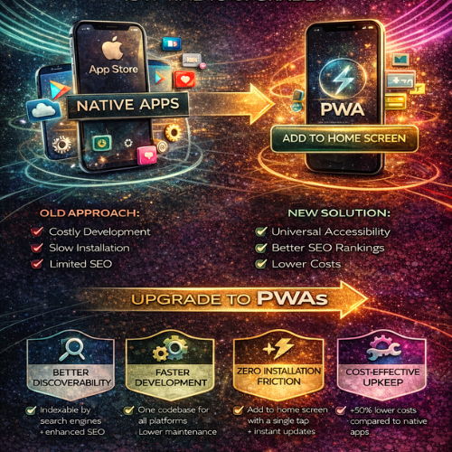
The digital landscape has changed. Once, the mark of a serious business was having a dedicated, native mobile app that lived exclusively in the App Store or Google Play. But today, that approach often leads to excessive costs, fragmented user bases, and development headaches. At WebWhizz, we understand that businesses need solutions that are fast, cost-effective, and universally accessible. This is where the Progressive Web App (PWA) steps in—a game-changing technology that delivers the best of the web with the functionality of a native application. If you’re evaluating whether your next digital project should be an expensive, standalone mobile app or a modern, unified web experience, this guide is for you. The Modern Mobile Dilemma: User Friction and Cost Before we dive into PWAs, let’s acknowledge the pain points businesses face with traditional native apps: High Development Cost: You need separate teams (or developers) for iOS and Android, managing two distinct codebases. The Store Barrier: Users must find your app, download it (often abandoning the process), sign in, and then grant permissions. Every step is a chance for abandonment. Maintenance Nightmares: Updating two codebases, constantly adhering to shifting store policies, and ensuring compatibility with every new operating system version is expensive and time-consuming. PWAs solve this dilemma by eliminating the barrier between the web and the installed application. What Exactly is a Progressive Web App? A Progressive Web App is simply a website built using modern web technologies that offers capabilities traditionally reserved for native applications. It is not an application wrapper; it is the evolution of the mobile website. The defining characteristic of a PWA is its ability to progress from a standard website to a powerful, installable application right in the user’s browser. The Essential Pillars of a PWA Experience PWAs combine cutting-edge browser features to deliver reliability and speed. At WebWhizz, when we build a PWA, we ensure it adheres to these core principles: 1. Installability (The App Shortcut) A user can "install" the PWA directly onto their device's home screen or desktop without visiting an app store. Once installed, it runs in its own window, separate from the browser interface, feeling exactly like a standard app. 2. Offline Capability (Service Workers) This is the "magic" behind the PWA. Using Service Workers (scripts that run in the background), a PWA can cache essential data. If a user loses connectivity, they can still browse critical sections, view product data, or even complete forms—ensuring reliable performance regardless of network conditions. 3. Push Notifications A crucial tool for engagement. PWAs can send timely, targeted notifications to users, even when the app is closed, helping drive repeat traffic and improve customer retention—a massive advantage over standard mobile websites. 4. Responsiveness and Security By definition, a PWA must be built using HTTPS (ensuring security and data integrity) and must be fully responsive, adapting seamlessly to any screen size, from a small phone to a large desktop monitor. The WebWhizz Advantage: Why PWAs are a Smart Business Investment When businesses partner with WebWhizz (webwhizzservices.com), they are looking for scalable solutions that maximize ROI. Here is why we champion the PWA approach for most modern digital projects: 1. Superior Discoverability and SEO Advantage A native app is trapped inside proprietary app stores, relying on store search algorithms. A PWA, however, is simply a website. Indexable by Search Engines: Every page, product, and service within your PWA is fully crawlable by Google and other search engines. This makes your content immediately discoverable, turning your app into an SEO powerhouse. Direct Sharing: Need to share a product page? You share a URL, not a download link. This natural link sharing vastly increases viral reach. For a detailed look at how we structure websites for maximum search visibility, visit our Web Development Services Page. 2. Streamlined Development and Lower Cost One of the biggest financial benefits of PWAs is the unified codebase. Instead of needing separate teams to maintain code for iOS, Android, and the web, WebWhizz develops a single, modern codebase using technologies like React or Angular. This singular focus results in: Faster Time-to-Market: Launching your product takes significantly less time since you aren't duplicating effort across platforms. Reduced Maintenance Overhead: Updating your application only requires updating one set of code, cutting long-term maintenance costs by up to 50%. 3. Zero Friction Installation Friction kills conversion. The journey for a native app user looks like this: · User sees link → Redirected to App Store → Waits for download → Installs → Finds icon → Launches app. The PWA journey is instant: · User visits site → Prompted to "Add to Home Screen" → Installed instantly. This frictionless process drastically increases the rate at which visitors convert into dedicated, installed users. Studies show that reduced friction leads to higher engagement and significantly improved conversions. 4. Effortless Updates Native apps require users to manually approve and download updates, sometimes forcing them to wait minutes before they can use the new version. With a PWA, updates are silent, instant, and automatic. Because the app loads directly from the web, the user is always running the latest version the moment they open it. When Should Your Business Choose a PWA? If your goal is high engagement, low development cost, and maximum cross-platform reach, a PWA is the ideal choice. They are particularly effective for: | Business Need | PWA Solution | | :--- | :--- | | E-commerce & Retail | Provides fast loading times (crucial for checkout conversion) and offline browsing of catalogs. | | Content Publishers | Ensures quick article loading, push notifications for breaking news, and reliability in low-connectivity areas. | | Internal Tools & SaaS | Offers cross-device compatibility for employees and eliminates the need for IT management of proprietary store accounts. | | Small Businesses & Startups | Lowers the initial barrier to entry, allowing rapid deployment without the hefty native app budget. | While a true native app may still be necessary for highly specialized use cases (like augmented reality or deep hardware integration), for 9 out of 10 businesses, the PWA provides all the necessary functionality with superior ROI. Taking the Next Step with WebWhizz The future of mobile is unified, fast, and accessible. PWAs represent a pivotal shift away from siloed applications and toward powerful, reliable web experiences. If your business is ready to ditch the complexity of managing multiple app stores and embrace a single, high-performing digital product, we are ready to guide you. At WebWhizz, we specialize in migrating traditional websites into robust PWAs, optimizing your existing infrastructure, and building scalable web applications from the ground up. Ready to discuss how a PWA can revolutionize your customer engagement and cut your development costs? Contact the WebWhizz team today for a comprehensive consultation.
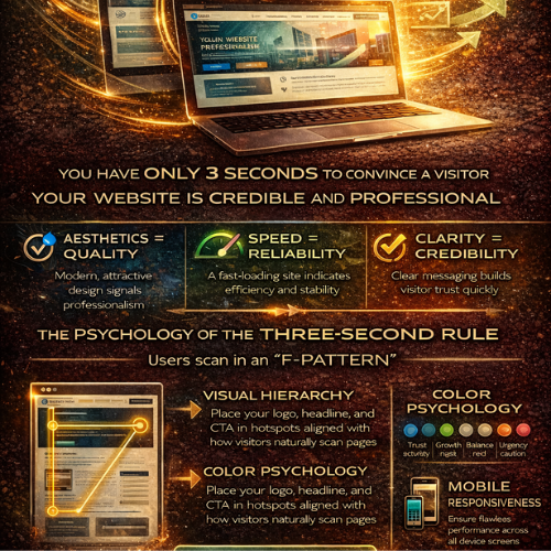
The Power of First Impressions How Your Website Wins Trust in Under Three Seconds
In the digital realm, there are no second chances for a first impression. You might have the most groundbreaking service, the most competitive pricing, or the most dedicated team—but if your website doesn't instantly communicate credibility and quality, your potential customer is already gone. We live in an age of hyper-speed digital interaction. Studies repeatedly show that users form an immediate judgment about a company's professionalism and trustworthiness based solely on visual aesthetics in less than three seconds. At Webwhizz, we don't just build websites; we craft digital first impressions designed to convert skepticism into trust. This post dives deep into the psychology behind the "three-second rule" and reveals exactly how world-class web design acts as your most crucial business asset. The Digital Handshake: Why Three Seconds Is Your Only Window Think about meeting someone for the first time. Before they even speak, you subconsciously process their posture, attire, and confidence level. Your website functions the same way. It is your ultimate digital handshake. In the fast-paced environment of the internet, visitors operate on cognitive fluency. This is the ease with which their brain can process the information presented. If the site is slow, cluttered, or aesthetically confusing, their brain registers "effort" and immediately equates that effort with "risk" and "unprofessionalism." The Heuristics of Instant Judgment User judgment isn't a complex analysis; it's a series of rapid, subconscious heuristics (mental shortcuts) based on visual cues: Aesthetics = Quality: Is the design modern, clean, and cohesive? Dated design suggests a company that doesn't prioritize its own image, leading users to assume the services offered are also dated or low quality. Speed = Reliability: If the site takes longer than two seconds to load, the user perceives the company as unreliable, inefficient, or too small to invest in proper hosting. Speed directly impacts patience and, therefore, trust. Clarity = Credibility: Can the user immediately identify who you are, what you do, and how they benefit? If they have to search for the value proposition, you've lost the battle. Ambiguity breeds distrust. Trust by Design: What Visitors Judge Instantly The three-second judgment process focuses on very specific, visible elements. Mastering these elements means mastering the impression you make. 1. Visual Hierarchy and the F-Pattern Users rarely read web pages; they scan them. They typically follow an "F-pattern"—scanning across the top header, down the left side, and across the content slightly lower down. Your critical trust signals must be located within these hot zones: The Hero Section: The first screen a visitor sees must contain your strongest headline, a compelling image or video, and a single, clear Call to Action (CTA). Logo and Branding: A professional, high-resolution logo instantly legitimizes your operation. Inconsistent or pixelated branding is a red flag. Navigation: Is the menu clean, intuitive, and consistent across all pages? Confusing navigation signals a confusing business structure. 2. Color Psychology and Credibility The colors you choose are not arbitrary; they evoke powerful emotional and psychological responses. | Color | Associated Feeling | Application for Web Trust | | :--- | :--- | :--- | | Blue | Trust, stability, logic, security | Ideal for financial, tech, or corporate services. | | Green | Growth, health, abundance, nature | Excellent for environmental, health, or financial stability brands. | | Gray/White | Balance, neutrality, professionalism | Crucial for clean layouts, providing negative space to highlight key information. | | Red/Orange | Urgency, excitement, caution | Best used sparingly for CTAs, not for foundational elements. | A harmonious and intentional color palette instantly communicates that your brand is thoughtful and professional. 3. Mobile Responsiveness: The Non-Negotiable Factor If a user lands on your site via a mobile device and the content is broken, requires pinching, or forces horizontal scrolling, the immediate judgment is fatal: This company is not serious. Mobile responsiveness is no longer a feature—it is the baseline expectation of digital presence. A site that performs flawlessly across every screen size communicates stability, attention to detail, and a commitment to serving the customer seamlessly. The Webwhizz Difference: Building Foundations of Trust At Webwhizz, we understand that building trust in three seconds is an engineering challenge rooted in psychology. Our comprehensive approach ensures that every element of your site—from the backend code to the front-end aesthetics—works in harmony to maximize your credibility score. 1. UX Optimization for Cognitive Fluency We design layouts that are immediately comfortable and familiar to the user. This means focusing on intuitive information architecture, clear signposting, and eliminating unnecessary visual noise. A Webwhizz design guides the user effortlessly toward the desired outcome, minimizing the effort required and maximizing trust. 2. High-Performance Technical Stack A beautiful website that takes six seconds to load is a failed website. We prioritize lightning-fast performance through: · Optimized imagery and asset loading. · Efficient, clean code implementation. · Strategic hosting solutions tailored to traffic needs. We ensure your site delivers information instantly, reinforcing the perception of speed, efficiency, and professionalism. 3. Professional Visual Branding and Cohesion Your website must feel like a natural extension of your brand identity. Our design process ensures visual consistency across all pages. We focus on: · Consistent typography and spacing. · High-quality photography or illustration (no generic stock photos). · Strategic use of negative space to draw the eye to core messaging. This cohesion eliminates visual friction and establishes a powerful, unified brand image that screams reliability. Ready to Make a Lasting Impression? Your website is often the very first interaction a client has with your brand. Do you want that interaction to communicate confusion and friction, or confidence and expertise? In a competitive market where attention is the most valuable commodity, harnessing the power of the first impression is not a luxury—it’s a prerequisite for success. About Webwhizz We are Webwhizz, and our mission is simple: to transform your digital presence into a high-performance trust magnet. We specialize in building fast, scalable, and beautifully designed websites and digital strategies that capture attention and build immediate credibility. We invite you to learn more about our commitment to excellence and discover how our tailored web design and development solutions can help you dominate the crucial first three seconds of engagement. Visit our Services Page to learn more about how we build trust through design. Don't let subpar design sabotage your potential. Partner with Webwhizz and ensure your first impression is the start of a lasting customer relationship.
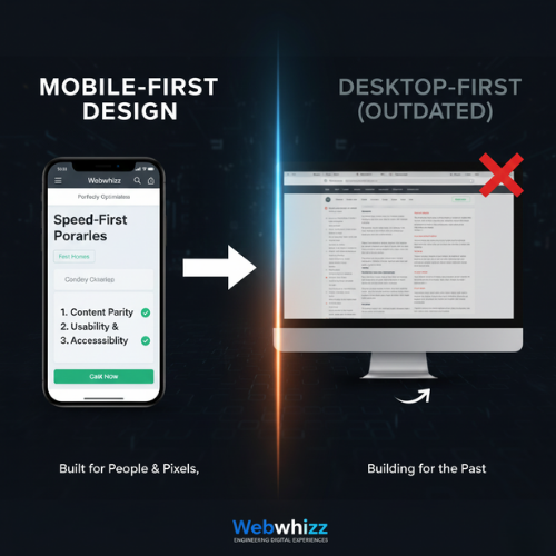
Mobile-First Design Why Your Website’s Future Must Start on a Smartphone
The Digital Landscape Has Shifted: Are You Still Building for the Past? For over a decade, the digital world has experienced a revolution fueled by convenience: the smartphone. Today, a staggering majority of web traffic, search queries, and e-commerce transactions happen on mobile devices. If your business relies on an outdated website built initially for large desktop screens, you are actively frustrating your potential customers and, perhaps more critically, penalizing your standing with Google. At Webwhizz, we don't just build websites; we engineer digital experiences optimized for the way people actually use the internet today. This commitment is centered entirely around one pivotal methodology: Mobile-First Design (MFD). In this comprehensive guide, we'll dive deep into what MFD truly means, why it’s non-negotiable for modern SEO, and how embracing this strategy with Webwhizz (webwhizzservices.com) ensures your business is positioned for success. What Exactly is Mobile-First Design (MFD)? Mobile-First Design is a revolutionary philosophy in web development that flips the traditional process on its head. Historically, developers built the large, complex desktop version of a site first, then "shrunk" or adapted it to fit smaller screens (a process called responsive design). MFD, however, starts with the smallest screen and the most constrained environment. The MFD Philosophy: Content, Context, and Constraint The core principle of MFD is simple: start with the essential. When designing for a 4-inch screen, developers are forced to prioritize the most crucial content, features, and calls-to-action. This ensures that the user experience (UX) is fast, uncluttered, and highly focused from the very beginning. Only after the mobile experience is perfected do we progressively enhance the design, adding richer elements, larger images, and supplemental navigation for tablet and desktop users. MFD vs. Standard Responsive Design While Responsive Design ensures a site looks decent on any device, MFD dictates the starting point of the development process: | Feature | Responsive Design (Traditional) | Mobile-First Design (Modern) | | :--- | :--- | :--- | | Starting Point | Desktop screen (large canvas). | Mobile screen (small canvas). | | Priority | Retaining desktop features; adapting them later. | Prioritizing essential content and speed first. | | Performance | Can inherit legacy code bloat from the desktop version, slowing mobile load times. | Optimized performance because speed is baked into the initial design requirements. | | Outcome | Often functional, but sometimes slow or clunky on mobile. | Inherently fast, focused, and intuitive across all devices. | Why Google Made Mobile-First Indexing Mandatory If customer experience wasn't enough motivation, search engine optimization (SEO) makes Mobile-First Design a requirement, not an option. Google understands where its users are searching, and in 2018, it began rolling out Mobile-First Indexing (MFI). By 2021, MFI became the standard for almost all websites globally. The Mobile-First Indexing Imperative MFI means that Google's search crawlers now primarily look at the mobile version of your website to determine its ranking, relevance, and overall quality. In simple terms: If your desktop site is beautiful but your mobile site is slow, broken, or missing key content, Google will rank you based on the poor mobile experience. The Core Pillars of Mobile Ranking Google focuses on three main areas when assessing the quality of your mobile site: Speed and Performance: Slow sites equal high bounce rates. Google heavily weights page load speed, especially the metrics outlined in their Core Web Vitals (CWV) initiative (LCP, FID, CLS). MFD naturally addresses these by limiting resource-heavy elements on initial load. Content Parity: The mobile version must contain the same high-quality, relevant content as the desktop version. If you hide crucial paragraphs or keywords on mobile, Google might not index them. Usability and Accessibility: Can users easily click buttons, read the text, and navigate without zooming or horizontal scrolling? Mobile-First Design ensures touch targets are large enough and fonts are legible by default. The Webwhizz Advantage: Building for People and Pixels Choosing Mobile-First Design is the single best investment you can make in your website’s future. It provides immediate, measurable benefits across key business metrics: 1. Superior User Experience (UX) When a design starts with mobile constraints, the result is an inherently clean and efficient experience. Users find what they need quickly, leading to higher conversion rates, longer sessions, and lower bounce rates. 2. Immediate SEO Dominance MFD sites are optimized for speed from the ground up, giving you a distinct competitive advantage in search results. Higher performance scores directly correlate with higher rankings, ensuring your business is found by customers searching on the go. 3. Future-Proofing Your Investment As new devices (watches, foldable phones) enter the market, a Mobile-First site is far easier to scale and adapt than a desktop-heavy site. Your investment in MFD today protects you from costly redesigns tomorrow. Our Approach at Webwhizz At Webwhizz, we integrate MFD principles into every stage of development. Our team understands that a successful site is not just about aesthetics; it's about engineering speed and efficiency. This is why our projects focus on: Prioritized Asset Loading: Ensuring essential content (text, main image) loads instantly, while secondary assets load later. Optimal Touch Targets: Designing interfaces specifically for finger interactions, minimizing user frustration. Streamlined Codebase: Building lean, optimized code that keeps performance metrics high, consistently passing Core Web Vitals checks. We believe in providing digital solutions that drive real results for our clients. To learn more about our methodologies, our success stories, and the values that drive our team, we invite you to read more About Us. Checklist: Is Your Site Truly Mobile-First? If you are unsure whether your current platform meets the demands of MFI, ask yourself these crucial questions: Test 1: Speed: Does your page load in under 3 seconds on a standard 3G connection? Test 2: Layout: Do you ever have to pinch-to-zoom or scroll horizontally to read content? Test 3: Content Consistency: Is all the crucial content, imagery, and navigation available on the mobile version, or are essential elements hidden? Test 4: CWV Score: Does your site consistently achieve "Good" scores across Google’s Core Web Vitals report (LCP, FID, CLS)? If the answer to any of these is no, your site is likely suffering from poor mobile performance and diminished search visibility. Don't Be an Afterthought. Be the Priority. The digital clock isn’t ticking backwards. Mobile dominance is the present and the future. Relying on a desktop-first design is like setting up a billboard in a town where everyone only drives through the back alley—you’re targeting the wrong audience, on the wrong device, and failing to meet Google’s criteria for quality. If you are ready to stop penalizing your business and start dominating search rankings, it’s time to embrace the proven power of Mobile-First Design. Webwhizz (webwhizzservices.com) is here to transform your digital strategy. Let us build a blazing-fast, highly optimized mobile experience that serves both your customers and the world’s leading search engine. Ready to put your customers first, every single time? Contact Webwhizz today to discuss your next mobile-first project!
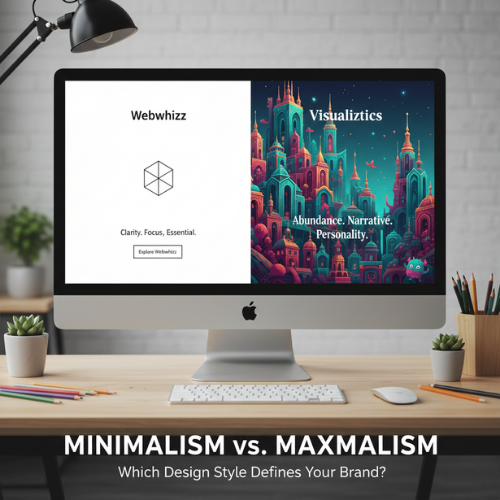
Minimalism vs. Maximalism Which Design Style Defines Your Brand
In the vast, noisy digital landscape, the visual identity of your brand is your primary handshake. Every element—from the font on your logo to the amount of whitespace on your homepage—sends a signal. Two competing philosophies dominate the world of aesthetics and design, each offering a fundamentally different approach to communication: Minimalism and Maximalism. But this isn't just about choosing furniture or paint colors. When translating these styles to your digital presence and brand identity, you are choosing a voice, a personality, and a user experience (UX) strategy. Which philosophy is right for your brand? Let’s dive into the contrast and help you decide which side of the spectrum best serves your strategic goals. The Core Philosophy: Defining the Styles Before we apply these concepts to the digital realm, it’s crucial to understand the foundational definitions that govern these design movements. 1. Minimalism: The Doctrine of Essentialism Minimalism is built on the principle of less is more. It is the intentional stripping away of non-essential elements to highlight the core purpose or message. Core Tenets: Purity and Clarity: Focusing on essential forms, materials, or content. Whitespace: Utilizing negative space as a powerful design element. Functionality Over Decoration: Every element must serve a purpose. Limited Palettes: Often featuring monochrome, muted, or achromatic colors. 2. Maximalism: The Embrace of Abundance Maximalism is the deliberate rejection of restraint. It is a philosophy that embraces rich complexity, layered texture, visual storytelling, and personality. Core Tenets: Layering and Depth: Utilizing multiple textures, patterns, and colors simultaneously. Narrative Richness: Every object or design element contributes to a larger story. High Personality: Bold, often quirky, and highly memorable aesthetics. Visual Complexity: Embracing density, saturation, and intricate detail. Digital Minimalism: Clarity and Focus In web design and branding, minimalism is the gold standard for efficiency and clarity. Brands that thrive on trust, high conversion rates, and seamless mobile experience often lean heavily on this style. The Aesthetic of Digital Minimalism: Vast Whitespace: Directs the user's eye instantly to the key call-to-action (CTA). Stripped-Down Navigation: Fewer links, often hidden behind a hamburger menu to maintain a clean interface. Monochromatic Photography: High-quality, impactful images that stand alone without heavy editing or borders. Strong Typography: Fonts are often sans-serif, acting as the primary visual element. Key Brand Benefits of Digital Minimalism | Benefit | Strategic Value | | :--- | :--- | | Increased Trust | The clean, organized nature suggests efficiency and professionalism (ideal for FinTech, SaaS, or luxury brands). | | Faster Load Times | Less content and fewer visual assets lead to superior site performance and better SEO rankings. | | Superior UX | By removing distractions, the user journey is simplified, leading to higher conversion rates and reduced cognitive load. | | Mobile-First Effectiveness | Minimalist designs translate flawlessly to small screens, maintaining speed and clarity. | When Minimalism Can Fall Short While effective, minimalism isn’t always the right fit. If your brand is highly creative, historical, or focused on community engagement, a pure minimalist approach can feel too sterile, cold, or generic. It can also make it difficult to convey a complex product offering quickly. Digital Maximalism: Personality and Engagement Digital maximalism is the antidote to bland conformity. It allows a brand to be unapologetically unique, memorable, and deeply engaging, prioritizing an immersive experience over pure transactional efficiency. Think of sites that use rich, custom illustrations, dense scrolling narratives, unusual cursor animations, and retro or complex typefaces. The Aesthetic of Digital Maximalism: Pattern Overload: Using distinct, repeating patterns in backgrounds and borders. Rich Color Palettes: Utilizing deep, saturated, or contrasting colors (think Neoclassical, Art Deco, or specific retro themes). Layered Visuals: Text superimposed over images, dynamic scrolling effects, and detailed iconography. Custom Typography: Using highly expressive, display fonts that reflect unique brand characteristics. Key Brand Benefits of Digital Maximalism | Benefit | Strategic Value | | :--- | :--- | | Unforgettable Memorability | Brands that embrace maximalism stand out immediately in a sea of simple, flat designs. | | Powerful Storytelling | Ideal for brands selling an experience or a lifestyle (e.g., hospitality, high fashion, unique cultural goods). | | Niche Appeal | Attracts a specific, highly engaged audience who appreciate complexity and detail. | | Visual Depth | Conveys history, tradition, or specific artistic sensibilities instantly. | When Maximalism Can Be Detrimental The main risks of maximalism are poor performance and overwhelming users. If design choices aren't intentional, maximalism devolves into clutter. A maximalist website requires expert optimization to avoid slow load times, confusing navigation, and accessibility issues. Finding Your Brand Identity: The Webwhizz Integration Choosing between these two powerful design philosophies is not a matter of personal taste; it's a strategic business decision. Your design choice must align with your target audience, your brand values, and the feeling you want to evoke. To start charting your path, ask yourself these crucial questions: Self-Reflection Questions for Brand Design What is our primary goal? (e.g., Conversion? Education? Entertainment?) What is our brand personality? (e.g., Serious and reliable? Playful and disruptive? Luxurious and reserved?) How mature is our audience? (Younger, digitally savvy users often tolerate more complexity; older audiences often prefer clarity.) How many steps does the user need to take? (E-commerce sites need fast, simple checkouts—leaning minimalist. Portfolio sites can afford rich visuals—leaning maximalist.) How much content do we need to display? (Data-heavy sites often require minimalist structure to organize information.) About Us: The Strategic Guidance You Need If you're struggling to decide whether a highly refined, efficient minimalist approach or a bold, narrative-driven maximalist style will best serve your brand’s growth, you need expert strategic consultation. At Webwhizz, we understand that design isn't just about aesthetics; it's about strategy, performance, and user psychology. We specialize in translating your unique brand vision into a high-performing digital experience that maximizes ROI. We help you choose a design language—whether minimalist, maximalist, or a strategic hybrid—that speaks directly to your ideal customer. Ready to translate these ideas into a high-performing website? Learn more about us and explore our comprehensive web development and branding services: webwhizzservices.com. The Power of Intentional Design: A Hybrid Approach It’s important to note that very few successful digital brands are 100% one style or the other. Modern design often employs a hybrid, or Intentional Design, approach. An intentional approach borrows the best traits of both styles: Maximalist Personality on a Minimalist Skeleton: The site structure (navigation, layout) is clean and highly functional (minimalist), but the featured content areas (hero images, product pages) are rich, textured, and narrative-driven (maximalist). Visual Hierarchy: You can use minimalism to govern the essential elements (checkout pages, contact forms) where clarity is paramount, while allowing maximalism to dominate the less crucial, more experiential pages (blog, "About Us"). The goal is always to achieve a cohesive brand identity—a style where every choice, whether subtle or loud, reinforces your core message. Conclusion The battle between Minimalism and Maximalism is the battle between efficiency and expression. If your brand values speed, ease of use, and professional trust, the uncluttered efficiency of Minimalism is likely your strongest tool. If your brand is defined by history, artistic complexity, or a desire to create a deeply memorable, immersive experience, Maximalism offers the canvas for your story. Whichever path you choose, remember that great design is purposeful. It’s a foundational element of your business strategy, not just a coat of paint. Define your values first, and the design style will naturally follow. Ready to build a website that aligns perfectly with your brand identity? Contact the experts at Webwhizz today.
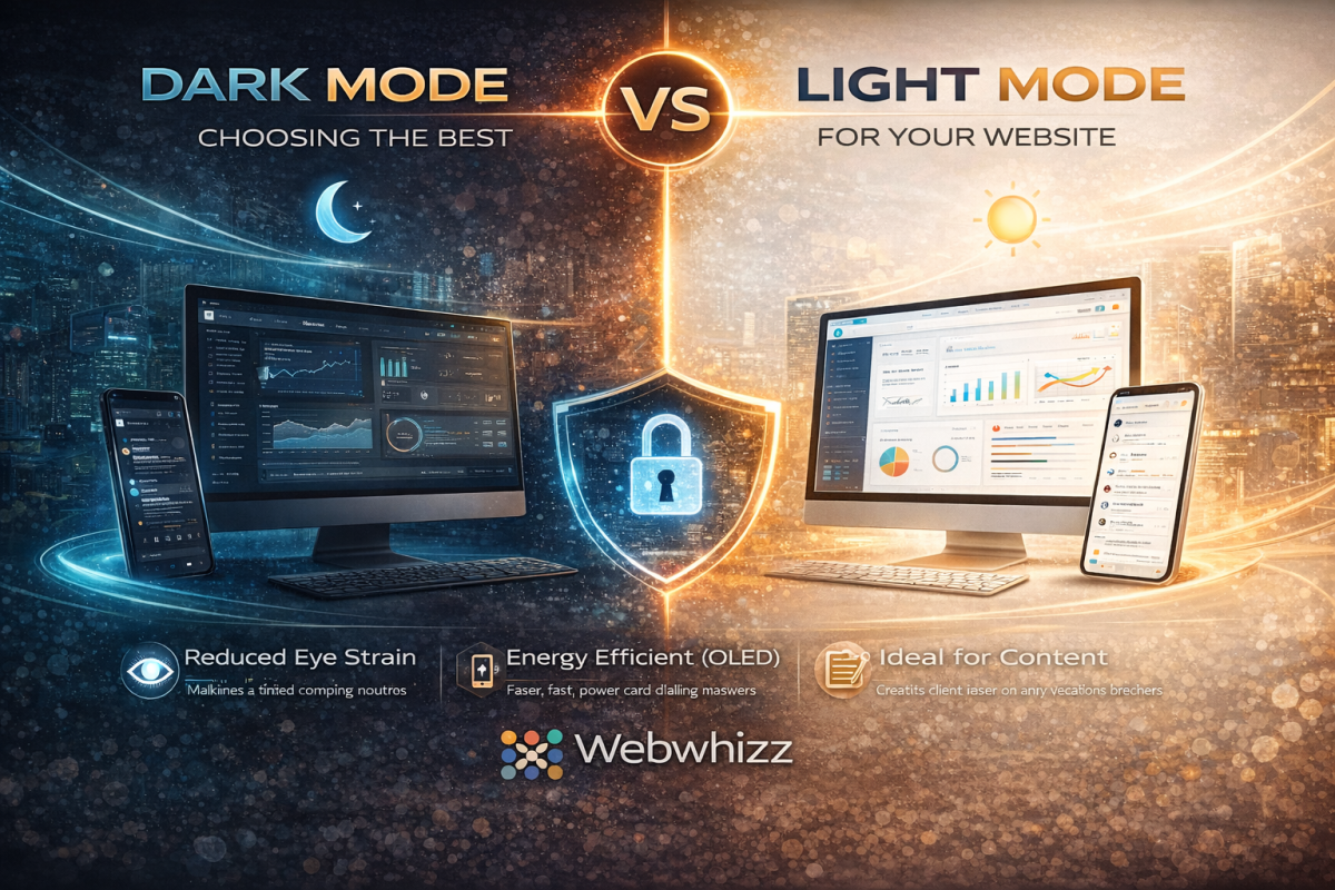
Dark Mode vs. Light Mode Optimizing Your Website for Peak User Experience
In the modern digital landscape, few debates spark as much conversation among users and designers alike as the choice between Dark Mode and Light Mode. It’s more than just a preference; it’s a critical decision that affects readability, accessibility, and overall User Experience (UX). As digital experience experts, we at Webwhizz understand that the perfect website balances aesthetics with function. This deep dive will explore the science, the pros, and the cons of both modes, helping you determine the ideal design strategy for your own website. The Science of Sight: How Our Eyes Process Contrast To understand the UX implications of color schemes, we must first look at how the human eye processes contrast. The core difference lies in how our pupils react to the display brightness: Light Mode (Dark Text on Light Background): The light background causes the pupil to constrict. This smaller opening, much like a camera aperture, results in a sharper, clearer focus. This is why standard print books have used black text on white paper for centuries—it generally maximizes text clarity and reading speed, especially in well-lit environments. Dark Mode (Light Text on Dark Background): The dark background causes the pupil to dilate (widen) to take in more light. While this reduces perceived glare and strain in low light, the wider pupil can sometimes introduce more minor refractive errors (known as the "halation effect" or "Müller-Lyer illusion"), causing light text to appear slightly blurry or glow against the dark background for some users, particularly those with astigmatism. Deep Dive into Light Mode (The Traditional Standard) Light Mode, with its traditional white or light-colored canvas, has been the default setting for most operating systems and websites since the dawn of computing. The Advantages of Light Mode Light Mode isn’t just tradition; it holds significant UX benefits, particularly for content-heavy sites: Optimal Readability in Daytime: In bright or well-lit environments, the high contrast provided by dark text on a light background minimizes eye strain and maximizes reading comprehension. Superior Long-Form Reading: Decades of cognitive research support the fact that most users process long passages of text slightly faster and more efficiently when reading dark-on-light. Print and Accessibility Standards: Light Mode adheres closely to the contrast ratios commonly expected in print media, which feels familiar and accessible to the vast majority of users. Vibrant Visuals: Light backgrounds often make colorful images, charts, and brand elements appear brighter and more vibrant. The Drawbacks of Light Mode Excessive Glare: In low-light environments (e.g., reading late at night), the bright white screen acts as a harsh light source, leading to significant eye strain and discomfort. Blue Light Exposure: High exposure to the blue light emitted by bright screens can interfere with natural sleep patterns (circadian rhythm). Deep Dive into Dark Mode (The Modern Trend) Dark Mode exploded in popularity over the last decade, transitioning from a specialized tool for developers and gamers into a mainstream feature on all major operating systems. It is often perceived as sleeker, more modern, and easier on the eyes. The Advantages of Dark Mode Reduced Eye Strain in Low Light: This is the primary benefit. By decreasing the overall luminance of the screen, Dark Mode drastically reduces glare and light emission in dark environments. Energy Efficiency (OLED/AMOLED): For devices utilizing OLED or AMOLED screens (many modern phones and tablets), displaying true black pixels means those pixels are completely turned off. This can lead to substantial battery savings. Aesthetic Appeal: Dark themes often lend themselves to sophisticated, dramatic, and immersive design aesthetics, making them popular for creative portfolios, video streaming, and entertainment sites. Focus Enhancement: By subduing the UI elements, Dark Mode can help the user focus intensely on content like images or videos that use bright, contrasting colors. Key Challenges in Dark Mode Implementation Implementing Dark Mode effectively requires careful design to avoid common pitfalls: The Halation Effect: As noted earlier, the glowing effect of light text on a dark background can cause fatigue or fuzziness for some users, particularly those with astigmatism. Poor Contrast Choices: A common mistake is using pure white text (#FFFFFF) on true black (#000000). This maximum contrast can actually be too harsh. Professional designs often rely on very dark gray backgrounds and off-white or light gray text to soften the transition and improve readability. Color Shift: Saturated colors (like bright reds or blues) that look great in Light Mode may appear overly aggressive or "vibrating" in Dark Mode, requiring a complete color palette adjustment for the alternate theme. The Ultimate UX Question: Which is Better for Your Website? The truth is, there is no single "best" choice. The optimal mode depends entirely on your target audience, the nature of your content, and the context in which your site is typically viewed. 1. Analyze Your Content and Audience | Website Type | Primary Recommendation | Rationale | | :--- | :--- | :--- | | Blogging/News/E-commerce | Light Mode (Default, with Dark Option) | Prioritizes fast readability and quick scanning of dense product information. | | Creative Portfolios/Film/Gaming | Dark Mode (Default, with Light Option) | Enhances visual storytelling, provides a cinematic feel, and minimizes distraction. | | Data Dashboards/Coding Platforms | Dark Mode (Strong Preference) | Reduces strain during long sessions and makes complex color-coded elements stand out clearly. | 2. Prioritize User Choice The gold standard in modern web design is dynamic theming. Instead of forcing a choice, empower your users: System Preference Matching: Automatically detect the user's operating system setting (Light or Dark) and default to that theme. Visible Toggle Switch: Provide a clear, accessible toggle switch (usually in the header or user profile settings) so the user can switch instantly without losing their place. How Webwhizz Makes the Choice Easy Implementing a dynamic, multi-themed website is technically complex. It requires not just flipping colors, but ensuring that all elements—from icons and logos to accessibility features and embedded widgets—maintain optimal contrast ratios in both environments. This is where the expertise of a professional web design team becomes essential. About Webwhizz At Webwhizz, we understand that a truly dynamic website is one that adapts to the user. We specialize in designing and developing modern, high-performance websites that prioritize accessibility, aesthetic appeal, and technical precision. We don't just build websites; we craft personalized digital experiences that adapt to evolving user preferences. When we design your site, we analyze your audience and content to advise you on the most effective default theme. Crucially, we then handle the meticulous process of developing a fully optimized, WCAG-compliant Dark Mode and Light Mode, ensuring seamless transitions and perfect contrast across all devices. Ready to offer your users the ultimate control over their digital experience? Learn more about our UX-focused design services at webwhizzservices.com. Conclusion: Designing for Flexibility The debate between Dark Mode and Light Mode is a reflection of shifting user expectations. Users no longer expect a static experience; they expect personalization. While Light Mode remains the gold standard for pure text readability and daylight use, Dark Mode offers substantial benefits for low-light environments, energy savings, and modern aesthetics. For optimal User Experience, the winning strategy is clear: Don't choose one. Provide both. By integrating both themes seamlessly into your design, you show your audience that you value their comfort, health, and personal preference—a hallmark of professional, high-quality web development.
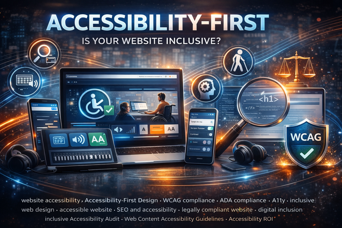
Accessibility-First Design Why Making Your Site Usable for Everyone is Now a Legal and SEO Requirement
Welcome to the digital age, where every website is a front door to your business. But what happens when that door is locked for millions of potential customers? For too long, website accessibility—the practice of ensuring people with disabilities can perceive, understand, navigate, and interact with the web—was treated as a feature to be added later, or worse, an afterthought. That era is over. At WebWhizz, we believe that Accessibility-First Design is not merely a moral obligation; it is a critical component of modern web development, directly impacting your legal exposure, brand reputation, and most importantly, your search engine visibility. If your goal is sustainable digital growth, making your site usable for everyone is now essential. Beyond Ethics: Why Accessibility is a Hard Requirement When we talk about accessibility (often abbreviated as A11y), we are talking about ensuring that people with visual, auditory, cognitive, and motor impairments can successfully use your platform. While the ethical case for inclusion is clear, the pressing reality for business owners involves two primary, high-stakes factors: legal compliance and market performance. The Legal Hammer: Understanding Digital Compliance In many jurisdictions, websites and digital services are treated as "places of public accommodation." This means they must comply with existing disability laws. The most prominent example in the United States is the Americans with Disabilities Act (ADA). While the ADA was written before the internet explosion, courts are increasingly applying its provisions (specifically Title III) to websites and mobile applications. The practical standard courts rely on for determining digital compliance is the Web Content Accessibility Guidelines (WCAG), developed by the World Wide Web Consortium (W3C). | WCAG Principle | What it Means for Your Site | | :--- | :--- | | Perceivable | Users must be able to recognize the content (e.g., proper contrast, alternative text for images). | | Operable | Users must be able to interact with all controls (e.g., full keyboard navigation). | | Understandable | Content and navigation must be predictable and clear. | | Robust | The site must work across different technologies, including various browsers and screen readers. | The Risk of Non-Compliance Ignoring these standards is a high-stakes gamble. Litigation regarding inaccessible websites has skyrocketed, leading to demand letters, costly settlements, and mandatory remediation—often resulting in a complete site overhaul under strict deadlines. To mitigate this severe risk, proactive auditing is essential. At WebWhizz, we specialize in comprehensive WCAG 2.1 and 2.2 Level AA compliance audits as part of our core digital consulting services, ensuring your site is legally sound before the courtroom calls. The SEO Superpower: Accessibility as a Ranking Factor While lawsuits drive reactive change, smart business owners realize that accessibility is one of the most powerful, yet overlooked, SEO strategies available. Google's primary goal is to provide the best possible experience for every user. When you build a site that is fully accessible, you are inherently building a site that is also easily readable and indexable by search engine bots. How Google Rewards Usability and Semantic HTML Many accessibility requirements align perfectly with Google’s Core Web Vitals and other ranking signals. When you optimize for A11y, you are optimizing for SEO. Key A11y Features That Boost SEO: Semantic HTML: Screen readers rely on clear, semantic markup (e.g., using <h1>, <h2> for headings, <button> for buttons). Google's crawlers use this same structure to understand your content hierarchy and relevance. Proper semantic structure provides superior indexing compared to generic <div> tags. Alt Text and Image Descriptions: Providing descriptive alternative text for images (a critical component for visually impaired users) ensures that Google understands the context of your media, improving image search rankings and overall topical authority. Keyboard Navigation: A fully accessible site must be navigable using only the keyboard (essential for motor impairments). This necessity often leads developers to clean up messy code, resulting in better technical performance and faster load times—a major ranking boost. Clean Code and Performance: Building "accessibility-first" requires developers to focus on lean, well-structured codebases. This emphasis on technical excellence results in better site speed and stability, which Google heavily rewards. By focusing on accessibility, you are fundamentally improving the machine-readability of your content. You are building a stronger, faster, and more trusted digital experience—precisely what search algorithms are designed to favor. Implementing Accessibility-First: The WebWhizz Approach Transitioning to an accessibility-first methodology requires shifting how your team thinks about design and development. It's not a patch you apply at launch; it’s the foundational layer of the build. At WebWhizz Services, our accessibility integration covers everything from initial wireframes to final code deployment. Practical Steps to Achieve WCAG Conformity Whether you are building a new platform or remediating an existing one, these steps are crucial: 1. Audit and Strategy Before any major changes, you need a clear picture of your current state. Our WebWhizz Digital Auditing process includes both automated scanning and expert manual reviews to identify compliance gaps quickly. We provide a prioritized roadmap for remediation. Key Focus: Identifying contrast issues, keyboard traps, and ambiguous link texts. 2. Design and User Experience (UX) Accessibility starts with the visual design. Color Contrast: Ensuring text and background colors meet WCAG contrast ratios (Level AA). This is non-negotiable for low-vision users and also improves readability for everyone. Clear Focus Indicators: Providing highly visible outlines when a user tabs through the site, making it clear where they are on the page. Intuitive Hierarchy: Designing clear heading structures and consistent navigation patterns. 3. Development and Code Integrity The most critical step involves the code itself, which is where our specialized WebWhizz Development Services shine. We ensure that every element is semantic and robust. Keyboard Accessibility: Ensuring all interactive elements (menus, forms, sliders) are fully operable without a mouse. ARIA Attributes: Utilizing Accessible Rich Internet Applications (ARIA) roles and attributes where native HTML is insufficient (e.g., complex widgets like modals or tab sets) to properly communicate state and function to screen readers. Form Labeling: Every input field must have an explicit, associated label, ensuring assistive technology users can complete forms reliably. The ROI of Inclusive Design The argument for accessibility boils down to clear return on investment (ROI). By neglecting accessibility, you are effectively choosing to exclude approximately 15% of the global population from interacting with your site. That exclusion translates directly into lost market share. Increased Market Reach: Accessing the disability community and their buying power. Lower Legal Risk: Avoiding costly litigation and settlements. Superior SEO: Leveraging compliance features into high-ranking search visibility. Brand Reputation: Demonstrating commitment to corporate responsibility and inclusion. Conclusion: Build Better, Not Just Faster Accessibility-First Design is the future of the web. It is the framework that guarantees your digital assets are resilient against legal challenges and optimized for the constantly evolving requirements of search engines. It’s time to stop treating accessibility as a checklist item and start treating it as the foundation of your digital strategy. Ready to build a robust, legally compliant, and high-ranking website? Contact WebWhizz Services today for a full accessibility audit and a customized remediation plan tailored to drive your digital growth.
7 Signs Your Business Website Needs a 2026 Redesign
In the rapidly evolving digital landscape, your website is not just a digital brochure—it is your most crucial sales tool, customer service portal, and brand ambassador. If it’s struggling to keep up, your business is struggling to grow. While many business owners view a website redesign as a daunting expense, we view it as an essential investment in future profitability. By 2026, user expectations for speed, functionality, and aesthetic quality will be higher than ever. Staying stagnant is no longer an option; it’s a competitive liability. Here at Webwhizz, we specialize in transforming outdated digital platforms into high-performing conversion machines. We understand the warning signs of a failing website, and we want to help you spot them before they seriously damage your bottom line. If you’ve been ignoring that nagging feeling, it’s time to listen up. The Cost of Digital Stagnation Before diving into the seven signs, it’s important to understand the high stakes. A slow, non-responsive, or ugly website doesn’t just frustrate users; it directly impacts your revenue. Google penalizes slow sites, mobile users leave immediately, and outdated aesthetics erode trust faster than you can say “buy now.” A proactive redesign prepares you for success over the next five years, ensuring you meet modern SEO standards, capture mobile traffic, and deliver a user experience that converts visitors into loyal customers. The 7 Undeniable Signs It’s Time for a Redesign These signs often manifest subtly in analytics before turning into major issues. Pay close attention to these indicators if you want your business to thrive in 2026 and beyond. 1. Your Load Speeds Are Driving Customers Away (The 3-Second Rule) In the age of instant gratification, waiting even a few extra seconds for a page to load is unacceptable. Google has repeatedly stated that speed is critical for ranking and user experience (UX). If your pages are stuffed with unoptimized images, bloated code, or relying on outdated hosting, your performance suffers drastically. Red Flags Signaling Performance Failure: Poor Core Web Vitals Scores: Tools like Google PageSpeed Insights report low scores (often in the red) on metrics like Largest Contentful Paint (LCP) and First Input Delay (FID). These metrics directly impact SEO ranking. Time to Interactive is High: Your site might look loaded, but users can’t click on anything for several additional seconds. High Bounce Rate Correlates to Load Time: Analytics show a significant drop-off (high bounce rate) for visitors who spend more than three seconds waiting for the page to render. 2. Mobile Users Are Forced to Pinch and Zoom This is perhaps the clearest indicator of an antiquated website design. Modern websites must be "responsive," meaning they automatically adjust their layout, navigation, and images to perfectly fit any screen size—from a 27-inch monitor to a small smartphone. If your site requires visitors to awkwardly zoom in just to read text, navigate menus, or click a small button, you are actively losing mobile conversions. Did You Know? Over 60% of all global website traffic now originates from mobile devices. If your mobile experience is subpar, you are ignoring the majority of your potential audience. 3. Your Aesthetics Feel Stuck in the Last Decade Design trends evolve rapidly, and what looked sharp in 2018 now looks definitively dated. While aesthetics might seem secondary to functionality, they are crucial for building immediate trust and authority. Visitors judge your company’s professionalism and relevance based on your design within seconds. A site featuring heavy drop shadows, clunky stock photos, overly busy layouts, or unusual font choices immediately signals that your business might also be behind the times. A modern design embraces clean lines, ample white space, high-quality media, and intuitive visual hierarchies. 4. Your Site’s Navigation is Confusing and Overly Deep When a visitor lands on your website, they should be able to find the answer to their core question or the product they seek within three clicks. If your navigation is disorganized, if important calls-to-action (CTAs) are hidden, or if the user journey is complicated, they will leave. Conversion Blockers to Look Out For: Invisible CTAs: Are your "Contact Us" or "Request a Quote" buttons easy to see and clearly labeled? If they blend into the background, they aren't working. Too Many Menus: Confusing mega-menus that try to list everything at once overwhelm users. Internal Search Failure: If your internal search bar regularly returns irrelevant results, users quickly give up the search entirely. 5. Managing Content Has Become a Code Nightmare If every simple task—like changing a headline, updating a photo, or adding a new blog post—requires you to dive into complex code or call a developer for minor fixes, your website platform is inefficient. Modern Content Management Systems (CMS) are designed for ease of use. A redesign often includes migrating your site to a flexible, user-friendly platform (like WordPress or specialized headless CMS solutions) that empowers your internal team to manage content efficiently without relying on costly external support for daily updates. 6. You’re Embarrassed to Share Your Website URL This sign is purely emotional, but perhaps the most telling. If you actively hesitate to put your website address on your business cards, marketing materials, or proposal documents, you already know there's a problem. Your website should be a source of professional pride and a powerful conversion tool. If it’s currently a liability—something you feel obligated to apologize for—it is actively damaging your brand reputation and perceived authority in your industry. 7. It Relies on Deprecated or Unsupported Technology Behind the design, the technology powering your site might be obsolete. Using outdated frameworks, ancient PHP versions, or reliance on discontinued plugins poses serious security and functionality risks. These deprecated technologies are vulnerable to hacking and often conflict with modern browser standards. A redesign ensures your foundation is built on secure, scalable, and well-supported technology that can handle future growth and the ever-changing demands of the web. Ready to Whizz Past the Competition? Recognizing these seven signs is the first step toward reclaiming your digital presence. The next step is partnering with experts who can execute a seamless, results-driven redesign focused on measurable growth. About Webwhizz Here at Webwhizz, we don't just update your look; we engineer digital performance. Our team of designers, developers, and speed optimization specialists focus specifically on the issues that kill conversions: slow speeds, broken mobile layouts, and outdated user experience. If your website is suffering from the symptoms listed above, the 2026 redesign window is now. We provide comprehensive services tailored to: Lightning-Fast Speed Optimization: We analyze Core Web Vitals and optimize the underlying code and assets to ensure sub-three-second load times. Flawless Responsive Design: Guaranteed seamless performance and visual appeal across every device. Modern, Conversion-Focused Aesthetics: Delivering clean, trustworthy, and intuitive designs that elevate your brand authority. We pride ourselves on turning website liabilities into powerful assets. Learn more about our approach and see how we can transform your digital presence by visiting our website: webwhizzservices Don't Delay Your Digital Future The website you have today dictates the success you can achieve tomorrow. Waiting another year to address glaring issues with speed, responsiveness, or design is effectively giving your competition a significant head start. Don't let your business get caught in digital dust. If you identified with even three of the seven signs above, it’s time to stop mitigating risks and start maximizing opportunities. Contact Webwhizz today. Let’s build a fast, beautiful, and functional website ready to tackle the demands of 2026 and beyond.