The Digital Landscape Has Shifted: Are You Still Building for the Past?
For over a decade, the digital world has experienced a revolution fueled by convenience: the smartphone. Today, a staggering majority of web traffic, search queries, and e-commerce transactions happen on mobile devices.
If your business relies on an outdated website built initially for large desktop screens, you are actively frustrating your potential customers and, perhaps more critically, penalizing your standing with Google.
At Webwhizz, we don't just build websites; we engineer digital experiences optimized for the way people actually use the internet today. This commitment is centered entirely around one pivotal methodology: Mobile-First Design (MFD).
In this comprehensive guide, we'll dive deep into what MFD truly means, why it’s non-negotiable for modern SEO, and how embracing this strategy with Webwhizz (webwhizzservices.com) ensures your business is positioned for success.
What Exactly is Mobile-First Design (MFD)?
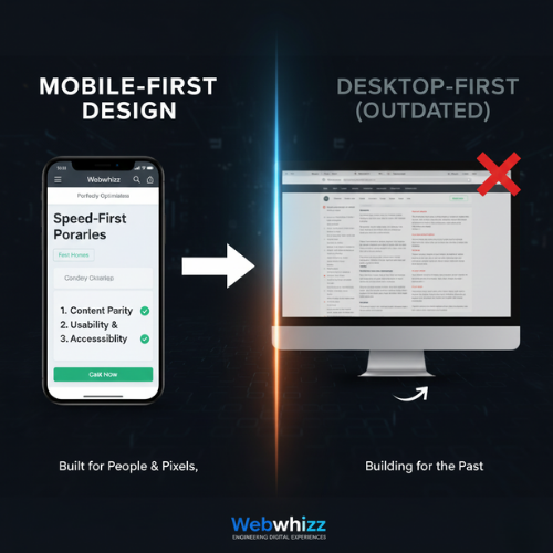
Mobile-First Design is a revolutionary philosophy in web development that flips the traditional process on its head.
Historically, developers built the large, complex desktop version of a site first, then "shrunk" or adapted it to fit smaller screens (a process called responsive design). MFD, however, starts with the smallest screen and the most constrained environment.
The MFD Philosophy: Content, Context, and Constraint
The core principle of MFD is simple: start with the essential.
When designing for a 4-inch screen, developers are forced to prioritize the most crucial content, features, and calls-to-action. This ensures that the user experience (UX) is fast, uncluttered, and highly focused from the very beginning.
Only after the mobile experience is perfected do we progressively enhance the design, adding richer elements, larger images, and supplemental navigation for tablet and desktop users.
MFD vs. Standard Responsive Design
While Responsive Design ensures a site looks decent on any device, MFD dictates the starting point of the development process:
| Feature | Responsive Design (Traditional) | Mobile-First Design (Modern) | | :--- | :--- | :--- | | Starting Point | Desktop screen (large canvas). | Mobile screen (small canvas). | | Priority | Retaining desktop features; adapting them later. | Prioritizing essential content and speed first. | | Performance | Can inherit legacy code bloat from the desktop version, slowing mobile load times. | Optimized performance because speed is baked into the initial design requirements. | | Outcome | Often functional, but sometimes slow or clunky on mobile. | Inherently fast, focused, and intuitive across all devices. |
Why Google Made Mobile-First Indexing Mandatory
If customer experience wasn't enough motivation, search engine optimization (SEO) makes Mobile-First Design a requirement, not an option.
Google understands where its users are searching, and in 2018, it began rolling out Mobile-First Indexing (MFI). By 2021, MFI became the standard for almost all websites globally.
The Mobile-First Indexing Imperative
MFI means that Google's search crawlers now primarily look at the mobile version of your website to determine its ranking, relevance, and overall quality.
- In simple terms: If your desktop site is beautiful but your mobile site is slow, broken, or missing key content, Google will rank you based on the poor mobile experience.
The Core Pillars of Mobile Ranking
Google focuses on three main areas when assessing the quality of your mobile site:
- Speed and Performance: Slow sites equal high bounce rates. Google heavily weights page load speed, especially the metrics outlined in their Core Web Vitals (CWV) initiative (LCP, FID, CLS). MFD naturally addresses these by limiting resource-heavy elements on initial load.
- Content Parity: The mobile version must contain the same high-quality, relevant content as the desktop version. If you hide crucial paragraphs or keywords on mobile, Google might not index them.
- Usability and Accessibility: Can users easily click buttons, read the text, and navigate without zooming or horizontal scrolling? Mobile-First Design ensures touch targets are large enough and fonts are legible by default.
The Webwhizz Advantage: Building for People and Pixels
Choosing Mobile-First Design is the single best investment you can make in your website’s future. It provides immediate, measurable benefits across key business metrics:
1. Superior User Experience (UX)
When a design starts with mobile constraints, the result is an inherently clean and efficient experience. Users find what they need quickly, leading to higher conversion rates, longer sessions, and lower bounce rates.
2. Immediate SEO Dominance
MFD sites are optimized for speed from the ground up, giving you a distinct competitive advantage in search results. Higher performance scores directly correlate with higher rankings, ensuring your business is found by customers searching on the go.
3. Future-Proofing Your Investment
As new devices (watches, foldable phones) enter the market, a Mobile-First site is far easier to scale and adapt than a desktop-heavy site. Your investment in MFD today protects you from costly redesigns tomorrow.
Our Approach at Webwhizz
At Webwhizz, we integrate MFD principles into every stage of development. Our team understands that a successful site is not just about aesthetics; it's about engineering speed and efficiency.
This is why our projects focus on:
- Prioritized Asset Loading: Ensuring essential content (text, main image) loads instantly, while secondary assets load later.
- Optimal Touch Targets: Designing interfaces specifically for finger interactions, minimizing user frustration.
- Streamlined Codebase: Building lean, optimized code that keeps performance metrics high, consistently passing Core Web Vitals checks.
We believe in providing digital solutions that drive real results for our clients. To learn more about our methodologies, our success stories, and the values that drive our team, we invite you to read more About Us.
Checklist: Is Your Site Truly Mobile-First?
If you are unsure whether your current platform meets the demands of MFI, ask yourself these crucial questions:
- Test 1: Speed: Does your page load in under 3 seconds on a standard 3G connection?
- Test 2: Layout: Do you ever have to pinch-to-zoom or scroll horizontally to read content?
- Test 3: Content Consistency: Is all the crucial content, imagery, and navigation available on the mobile version, or are essential elements hidden?
- Test 4: CWV Score: Does your site consistently achieve "Good" scores across Google’s Core Web Vitals report (LCP, FID, CLS)?
If the answer to any of these is no, your site is likely suffering from poor mobile performance and diminished search visibility.

Don't Be an Afterthought. Be the Priority.
The digital clock isn’t ticking backwards. Mobile dominance is the present and the future.
Relying on a desktop-first design is like setting up a billboard in a town where everyone only drives through the back alley—you’re targeting the wrong audience, on the wrong device, and failing to meet Google’s criteria for quality.
If you are ready to stop penalizing your business and start dominating search rankings, it’s time to embrace the proven power of Mobile-First Design.
Webwhizz (webwhizzservices.com) is here to transform your digital strategy. Let us build a blazing-fast, highly optimized mobile experience that serves both your customers and the world’s leading search engine.
Ready to put your customers first, every single time? Contact Webwhizz today to discuss your next mobile-first project!